How to Choose a Cabinet Color That Won’t Feel Dated in 3 Years
Picking the right cabinet color matters. Trends change fast, but your kitchen is the heart of your home. This guide shows Orlando homeowners how to choose timeless, trend-proof colors that still feel current. If you are planning a pro finish, our kitchen cabinet painting team at Repaint Florida LLC can help you lock in a palette that fits your space.
Why Trend‑Proof Beats Trendy in Orlando Kitchens
Trends like bright blue islands or high-contrast gloss can look exciting today and tired next season. Orlando’s open floor plans also mean a bold cabinet color can overwhelm nearby rooms. Choosing grounded, flexible hues lets you swap décor, art, or a backsplash later without repainting all your doors and drawers.
Start With Your Fixed Elements
Your cabinets live next to surfaces you probably will not change soon: countertops, floors, and backsplash. Use those as your starting point so the room feels pulled together.
- If you have warm counters or floors, lean into warm whites or greiges.
- If your backsplash is cool gray or marble, pick a soft neutral with a touch of warmth to avoid a sterile look.
- Wood tones nearby? Choose colors that respect the wood’s undertone, not fight it.
Still unsure? Browse our short read on local-friendly cabinet painting colors to see what pairs well with common Orlando finishes.
Understand Orlando Light and Humidity
Central Florida sunlight is strong and golden. It can warm up cool paint or make stark whites feel harsh at noon. Afternoon storms add humidity, which can deepen a color’s appearance. Always look at your color in morning light, mid‑day sun, and evening lamps so you know how it behaves across the day in Winter Park, Lake Nona, or College Park homes.
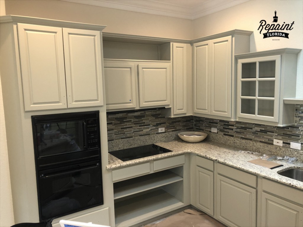
Choose a Timeless Base: Warm Whites and Greiges
When homeowners want a fresh look that lasts, warm whites and greiges are hard to beat. They brighten a room without turning chalky and they play well with both stainless and warm metals.
Look for these traits:
- Warm whites with a whisper of cream for a soft, welcoming feel
- Greiges that balance beige and gray for easy pairing with tile and wood
- Muted mushroom or taupe for subtle depth without feeling dark
Avoid ultra‑blue whites on large banks of cabinets. In Orlando’s sun, they can read icy and highlight every smudge.
When Two‑Tone Makes Sense
Two‑tone cabinets add interest without locking you into a fad. Keep it simple: light uppers to lift the room and slightly deeper lowers for grounding. This works especially well in smaller Orlando kitchens where a dark, single color might feel heavy.
Good pairs include:
Soft white uppers + greige or mushroom lowers for a calm, collected feel. Or try warm white uppers + muted olive lowers to add quiet character that still reads classic. Reserve saturated colors for the island or a small pantry wall so updates are easier later.
Accent Colors That Age Well
Not every accent holds up. Instead of electric teal or high‑gloss black, choose earthy, low‑chroma hues: muted greens, gray‑blues with a drop of warmth, or deep charcoal with a soft edge. These shades echo Florida’s natural palette and look intentional with stone, wood, and woven textures.
Sheen and Finish Choices That Stay Fresh
Color is only half the story. The right sheen helps cabinets look crisp longer. In busy Orlando kitchens, too much shine shows fingerprints and minor dings. A soft, furniture‑like finish keeps the focus on the color and the room’s lines.
If you want to update door profiles, new crown, or end panels during your color change, explore tasteful cabinet modifications that elevate the look without chasing fast‑passing trends.
Local insight: Orlando light shifts warm throughout the day. Tape up letter‑size samples on two walls and check them at breakfast, lunch, and dinner. What reads creamy at 8 a.m. can look flat at 2 p.m., and cozy again at 7 p.m.
Sample Like A Pro In Your Own Kitchen
You do not need dozens of swatches. Pick three contenders that respect your fixed finishes and view them next to hardware and appliances. Trust large samples over tiny chips. Stand back 8 to 10 feet and see how the color flows with adjacent rooms so the whole home feels consistent.
Common Color Mistakes And Easy Fixes
Mistake: choosing a ultra‑cool white in a warm house. Fix: slide to a warm white with a soft cream note. Mistake: matching lowers to a busy floor. Fix: pick a slightly lighter neutral so the floor can shine without visual noise. Mistake: dark uppers in a small, window‑limited kitchen. Fix: keep uppers light and let color live on the island or lowers.
Real‑World Palettes For Orlando Homes
Each of these families works across styles, from Baldwin Park bungalows to Dr. Phillips contemporary homes:
- Light and Bright: soft warm white uppers, pale greige lowers, brushed brass pulls
- Calm Contrast: warm white perimeter, muted olive island, matte black hardware
- Cozy Neutral: mushroom lowers, warm white uppers, satin nickel hardware
- Modern Classic: creamy white throughout, natural wood shelves, subtle warm backsplash
Tie Your Palette To Your Lifestyle
Families that cook daily in humid summers see more contact on lowers and around pulls. In those zones, medium neutrals can hide light wear better than bright whites. Love seasonal décor? Keep cabinets neutral and bring color through stools, art, or a rug so you can refresh the vibe without repainting.
Make It Seamless With Professional Application
A long‑lasting finish depends on professional prep, controlled conditions, and the right coating for your cabinet material. If you want durability and a factory‑smooth look, folding your color choice into a pro process is the smartest path. Learn what’s included with local kitchen cabinet painting so your chosen color looks its best, year after year.
See It In Your Space Before You Commit
Once you narrow to one or two palettes, create a simple mood board with a photo of your counters, a floor sample, and your top cabinet colors. Step into the hallway, then back into the kitchen. If the room still feels calm and intentional, you picked a winner. For more inspiration built around Orlando finishes, explore our quick guide to cabinet painting colors.
Bring It All Together
If your goal is a kitchen that still feels fresh three years from now, think harmony over hype. Choose a warm, forgiving base. Add quiet contrast where it helps the room read “designed,” not “decorated.” Let sunshine and evening lamps guide your final call, and keep bold choices to accents you can change later.
For a broader look at our approach to whole‑home style, start at Repaint Florida LLC’s home base for kitchen cabinet painting in Orlando, FL and see how we help local homes look timeless in our climate.